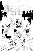
So this is where the traditonal art stops. I scan the page into the computer and it looks a little something like this. It is a 11x17 bristol page. I pencil with soft blue lead and mechanical pencil. I like the ease of mechanical pencils versus traditonal wood pencils. No sharpening. For Cubicles I used PITT pens to ink. Sometimes the artist in me screams to use brushes, but I find the pens fit my spastic personality. Plus I use brushes and toothbrushes for action lines and splatters. So it kind of works out.
So now I have to get rid of the pesky blue pencil lines. Thanks to the magic of photoshop I am able to insert a black and white adjustment layer. This lets me filter out blues. Though you have to be a little careful, you can filter out the inks as well. Also this adjustment layer got a little crazy when I got to the next step. I also filled in all the shapes with black. The reason I did this in photoshop and not directly on the paper was because I didn't want to waste the ink or the time.
Now what is this? This is a haphazzard ink wash. I just take a brush, some diluted ink and make a mess. Believe it or not, this is on every page in Cubicles. However its layer type was overlay, so it kind of 'vanishes'. But not with out leaving its mark. Observe in the next step.
So here using a standard photoshop, gritty brush I apply some gray tones. Besides picking a lighting direction, I don't spend much time trying to color inside the lines. The way I draw is really sketchy and I think clean coloring would be at odds with the rest of the art. So I just slap the colors down. Sometimes I am inside, sometimes out and other times I don't even reach the lines. This would usually look really bad, but since I have that ink wash mess from the step above, it looks like it makes perfect sense. I will also go back and erase some of the gray to make it look even more sketchy. See all the white lines around clothing creases.

To prove my point regarding the importance of the ink wash layer, please see figure 1. On the left if just the gray tones without the ink wash. On the right is with the ink wash. Notice how all the ugly, messy lines suddenly make sense?


 To prove my point regarding the importance of the ink wash layer, please see figure 1. On the left if just the gray tones without the ink wash. On the right is with the ink wash. Notice how all the ugly, messy lines suddenly make sense?
No comments:
Post a Comment